activity <- tbl_df(with(rikActivity,data.frame(Date=Start,Steps=`Steps (count)`)))
## Warning: `tbl_df()` was deprecated in dplyr 1.0.0.
## ℹ Please use `tibble::as_tibble()` instead.
activity$Date <- as.Date(activity$Date)
rik.calories <- rikfood %>% select(Date,Calories) %>% group_by(Date) %>% summarize(Calories = sum(Calories))

df <- na.omit(rik.calories[rik.calories$Date %in% as.Date(activity$Date),])


#activity %>% dplyr::filter(Date %in% df$Date) %>% group_by(Date) %>% summarize(Steps = sum(Steps))
df2 <- left_join(activity %>% dplyr::filter(Date %in% df$Date) %>% group_by(Date) %>% summarize(Steps = sum(Steps)),
                      df)
## Joining, by = "Date"

df <- df2
#df$Steps <- na.omit(activity[as.Date(activity$Date) %in% rik.calories$Date ,])[["Steps"]]
rik.motion <- data.frame(Date = df$Date, Calories = df$Calories, Steps = df$Steps)

g <- ggplot(data=rik.motion %>% gather(Measure,Value,-Date), aes(x=Date,y=Value,color=Measure)) +
  geom_point() + geom_smooth(method = "loess") +
  theme(legend.position = "right") + scale_color_hue(l = 40) + scale_y_log10() +
#  annotate("pointrange",x = kefir.day, y = 100, ymin = 100, ymax = 110, color = "blue", size = 0.1) +
#  annotate("text",y = 150, x =as.Date("2017-04-10"),  label = "Dates I drank kefir", color = "blue") +
  ggtitle("One Year of Exercise vs Calories Consumed")

ggsave("Oneyear.png")
## Saving 7 x 5 in image
## Warning: Transformation introduced infinite values in continuous y-axis
## Warning: Transformation introduced infinite values in continuous y-axis
## `geom_smooth()` using formula 'y ~ x'
## Warning: Removed 16 rows containing non-finite values (stat_smooth).My activity data
R
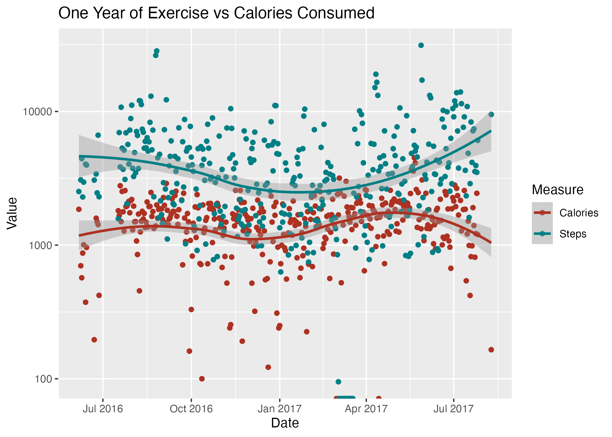
I’ve carefully tracked all my food and exercise for a year. Now I want to display, and then analyze it to see if I can find patterns.
Let’s look at the overall picture: Figure 1