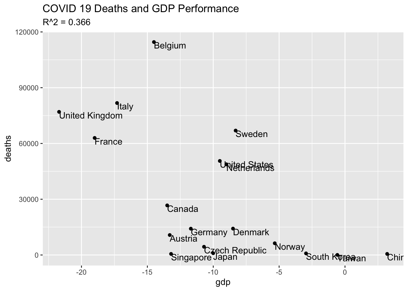
Comparing the COVID-19 death rate with the latest GDP data, we in fact see the opposite: countries that have managed to protect their population’s health in the pandemic have generally also protected their economy too
But the post never actually quantifies this, relying instead on a chart that kinda-sorta seems to justify the conclusion. Can we do better?
Since Our World in Data freely opens all their source data, our first step is to read it into R:
Code
data_raw <-read_csv(file.path("q2-gdp-growth-vs-confirmed-deaths-due-to-covid-19-per-million-people.csv"),col_types ="f_cdid_i") %>%transmute(country=Entity, date=mdy(Date),deaths =`Total confirmed deaths due to COVID-19 per million people (deaths per million)`,# population = `Population, total`, gdp_growth =`GDP growth from previous year, 2020 Q2 (%)` )data_raw %>%head() %>% knitr::kable(caption ="Raw data (first ten rows)" )
To manipulate data, we first need to convert the table to something more Tidy, and just include data from 2020:
And finally, we plot the result, which happily resembles the one at Our World in Data:
Code
data_df %>%ggplot(aes(y = deaths, x = gdp)) +geom_point() +geom_text(aes(label = country), hjust =0, vjust =1) +labs(title ="COVID 19 Deaths and GDP Performance",subtitle =paste("R^2 =",format(cor(data_df$deaths, data_df$gdp) ^2, digits =3)))
In the subtitle of the graph, I’ve computed the \(r^2\) value format(cor(data_df$deaths, data_df$gdp) ^2, digits = 3), a result that is not especially high. With values that vary between 0 (no association) and 1 (perfect association), I’d want the relationship to be quite a bit stronger before using this as the basis for any policy decisions.