Updated: 2023-06-08 with 2023-05-30 SiPhox Ferritin results.
My recent SiPhox blood testing made me aware of my unusually low ferritin levels – under 15 ng/mL (“normal” is above 30 ng/ML). Although I don’t have the symptoms of low blood iron – fatigue, shortness of breath, etc. – I am considering taking an iron supplement to get myself back into range.
Then I read a German research paper from 2000 that suggested low ferritin levels are common among regular blood donors. Another 2015 NIH study randomized 200 blood donors into two groups: those who took an iron supplement and those who didn’t. Result: 2/3rds of the non-supplement people were not back to their previous levels a full six months later. Fortunately, the situation is easily resolved, they say, by iron supplementation.1
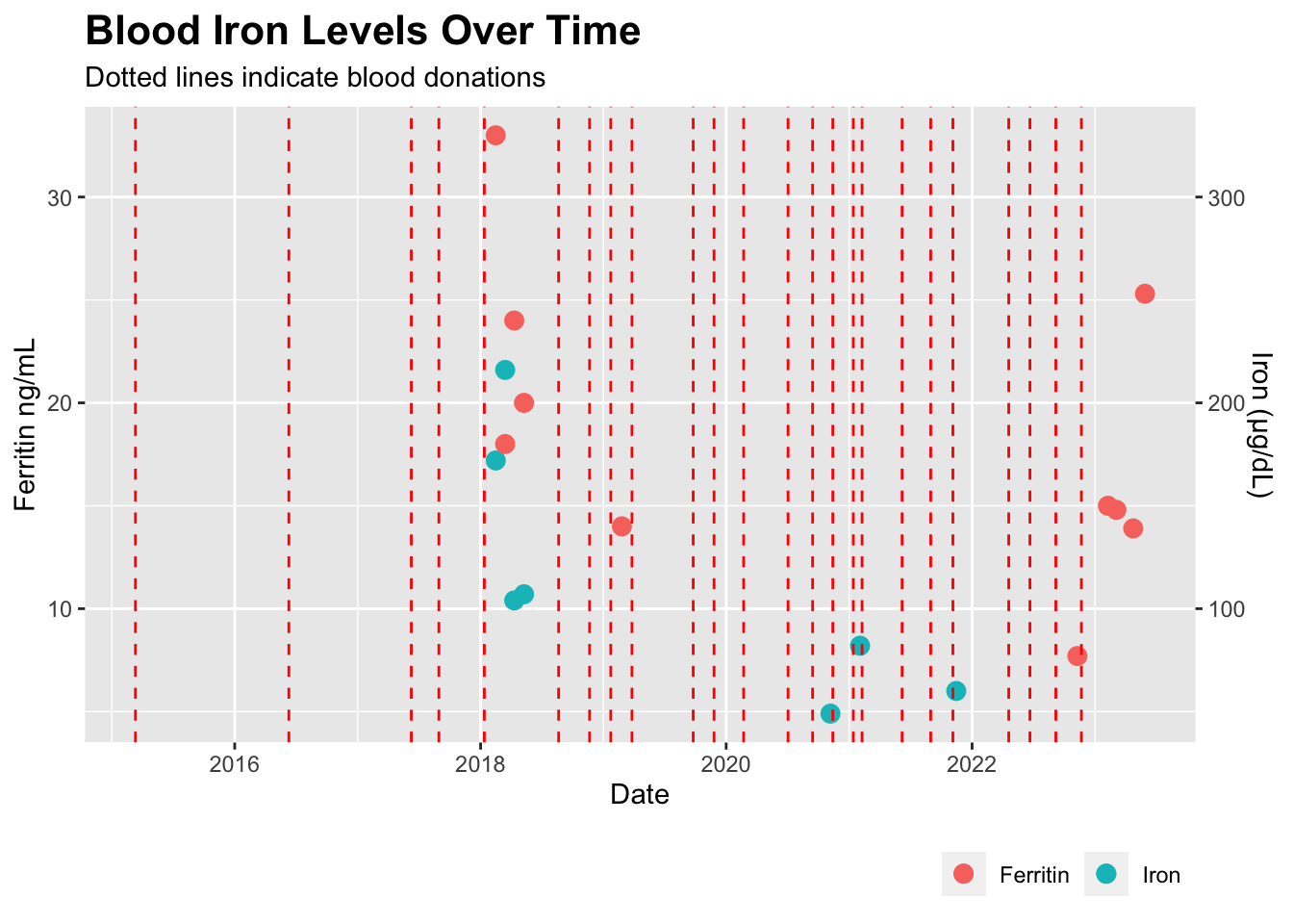
Bloodworks Northwest keeps an online table of all my donations, so I created this simple chart to show the effects on my ferritin levels.
Show the code
library(ggplot2)## all_blood_data is a dataframe with all previous lab data. Columns for each blood metric, plus Date and Donation.all_blood_data %>%filter(Date >"2013-01-01") %>%ggplot(aes(x = Date)) +geom_point(aes(y = Iron /10 , color ="Iron"), na.rm =TRUE, size =3) +geom_point( aes(y = Ferritin, color ="Ferritin"), na.rm =TRUE, size =3 ) +geom_vline(data = . %>%filter(Donation ==100), aes(xintercept = Date), color ="red", linetype ="dashed") +labs(title ="Blood Iron Levels Over Time",subtitle ="Dotted lines indicate blood donations",x ="Date",y ="Ferritin ng/mL",color =NULL,linetype =NULL ) +theme(legend.position ="bottom", legend.justification ="right",plot.title =element_text(size =16, face ="bold")) +scale_y_continuous(sec.axis =sec_axis(~ . *10, name ="Iron (µg/dL)") )
I had been doing several back-to-back experiments with InsideTracker, back in 2018, so I have lots of ferritin data for those years.
Statistics
Let’s see if we can find any statistical relationships. Let’s start by simply plotting ferritin levels relative to donation dates.
Show the code
library(tidyverse)library(kableExtra)library(corrplot)#| tbl-cap: "DaysAfter is the number of days following a blood donation"with_donation_data <- all_blood_data %>%mutate(Date =as.Date(Date)) %>%arrange(Date) %>%mutate(DonationDate =if_else(!is.na(Donation), Date, NA)) %>%fill(DonationDate, .direction ="down") %>%mutate(DaysAfter =as.numeric(Date - DonationDate)) %>%replace_na(list(DaysAfter =0))
Show the code
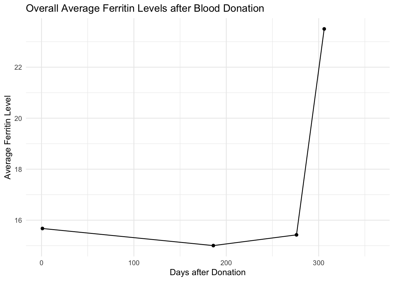
# Function to calculate the average Ferritin level within a given number of days before each donation# Function to calculate the average Ferritin level within a given number of days before each donationaverage_ferritin_before_donation <-function(data, days_before) { data %>%filter(is.na(Donation)) %>%group_by(DonationDate) %>%filter(DaysAfter >0& DaysAfter <= days_before) %>%summarize(AvgFerritin =mean(Ferritin, na.rm =TRUE), .groups ="drop")}# Calculate the average Ferritin level for different time windows before each donationtime_windows <-c(7, 14, 30, 60, 90, 180, 365)results <-lapply(time_windows, function(days_before) {average_ferritin_before_donation(with_donation_data, days_before) %>%mutate(TimeWindow = days_before)})# Combine the results from the list to a single dataframecombined_results <-do.call(rbind, results)# Adjust the TimeWindow variablecombined_results <- combined_results %>%mutate(DaysAfterDonation =max(TimeWindow) - TimeWindow +1)# Calculate the overall average Ferritin level for each day after donationoverall_avg_ferritin <- combined_results %>%group_by(DaysAfterDonation) %>%summarise(AvgFerritin =mean(AvgFerritin, na.rm =TRUE))# Create the plotggplot(overall_avg_ferritin, aes(x = DaysAfterDonation, y = AvgFerritin)) +geom_line(na.rm =TRUE) +geom_point(na.rm =TRUE) +labs(title ="Overall Average Ferritin Levels after Blood Donation",x ="Days after Donation",y ="Average Ferritin Level") +theme_minimal()
Ferritin levels are much higher the longer I go between donations
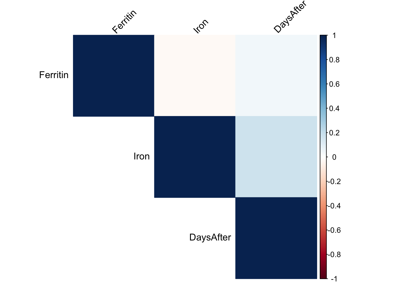
Now how about a simple correlation matrix:
Show the code
# Perform correlation analysiscorrelation <-cor(with_donation_data[, c("Ferritin", "Iron", "DaysAfter")], use ="pairwise.complete.obs")# Plot the correlation matrixcorrplot(correlation, method ="color", type ="upper", tl.col ="black", tl.srt =45)
The darker the color, the closer the correlation.
Show the code
# Melt the correlation matrix using tidyr# correlation_melted <- correlation %>%# as.data.frame() %>%# rownames_to_column(var = "Var1") %>%# pivot_longer(cols = -Var1, names_to = "Var2", values_to = "value")# # # Plot the correlation matrix using ggplot2# ggplot(data = correlation_melted, aes(x = Var1, y = Var2, fill = value)) +# geom_tile() + # scale_fill_gradientn(colors = c("darkblue", "white", "darkred"), values = c(-1, 0, 1)) +# # theme_minimal() +# theme(axis.text.x = element_text(angle = 45, vjust = 1, hjust = 1)) + # labs(x="",y="")# Create an empty matrix to store the p-valuesp_values <-matrix(NA, nrow =ncol(correlation), ncol =ncol(correlation))# Calculate the p-values for each correlation coefficientfor (i in1:(ncol(correlation)-1)) {for (j in (i+1):ncol(correlation)) { temp_data <- with_donation_data[, c("Ferritin", "Iron", "DaysAfter")] temp_data <- temp_data[complete.cases(temp_data), ] temp_data <-apply(temp_data, 2, function(x) as.numeric(as.character(x))) p_values[i, j] <-cor.test(temp_data[, i], temp_data[, j], method ="pearson")$p.value p_values[j, i] <- p_values[i, j] }}# Get correlation coefficientscor_coeffs <- correlation[lower.tri(correlation)]# Combine coefficients and p-values into a data framecor_results_df <-data.frame(Coefficient = cor_coeffs, P_Value =as.vector(p_values))correlation %>%kable(digits =2, caption ="DaysAfter is the number of days following a blood donation") %>%kable_styling()
DaysAfter is the number of days following a blood donation
Ferritin
Iron
DaysAfter
Ferritin
1.00
-0.02
0.04
Iron
-0.02
1.00
0.17
DaysAfter
0.04
0.17
1.00
The darker the color, the closer the correlation.
Show the code
# Assuming you have a correlation matrix called 'correlation'# Convert the correlation matrix to a vectorcor_vector <- correlation[upper.tri(correlation, diag =TRUE)]cor_results_df <- cor_results_df %>%cbind(Item =apply(expand.grid(colnames(correlation), rownames(correlation)), 1, paste, collapse ="-")) %>%select(Item, Coefficient, P_Value) # Reorder the columnskable(cor_results_df[2:4,], digits =2, col.names =c("Item", "Coefficient", "P Value"), caption ="None of the P-values is significant")
None of the P-values is significant
Item
Coefficient
P Value
2
Iron-Ferritin
0.04
0.98
3
DaysAfter-Ferritin
0.17
0.36
4
Ferritin-Iron
-0.02
0.98
The darker the color, the closer the correlation.
You can see there’s a small (inverse) correlation (-0.25) between Ferritin levels and the time passed since donating blood, but the P-value (0.36) doesn’t pass the significance test, probably due to too few data points. Meanwhile association between Iron levels is even lower, again no doubt because I’ve done so few iron tests.
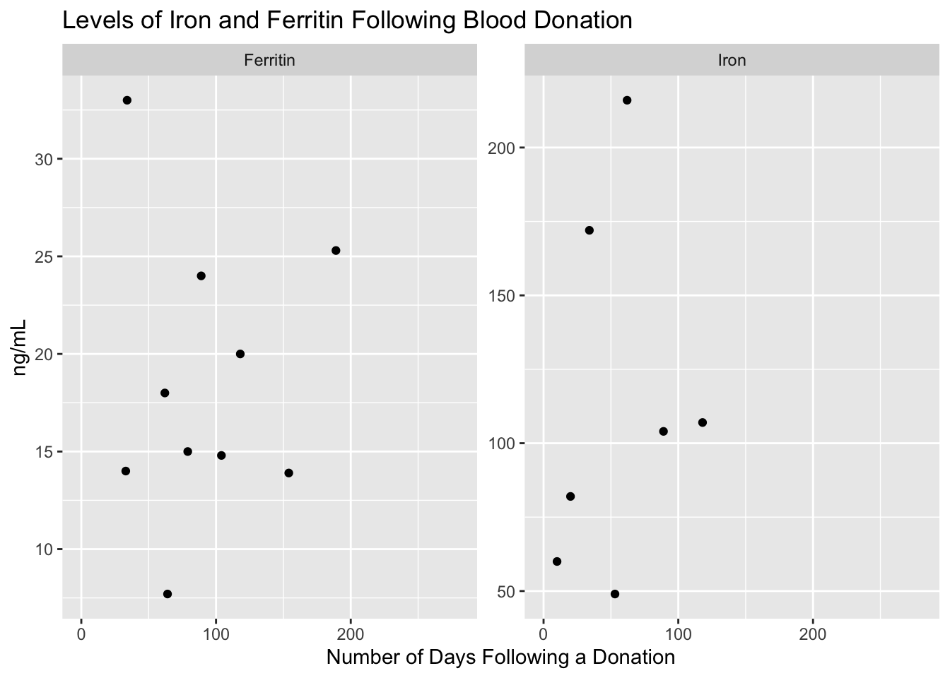
Another way to look at it is to simply plot the iron and ferritin levels in relationship to the number of days after a blood donation:
Show the code
# Check the relationship between Iron and DaysAfter# Create a dataframe for the scatterplotsscatterplot_data <- with_donation_data %>%select(DaysAfter, Iron, Ferritin)scatterplot_data %>%gather(key ="variable", value ="value", -DaysAfter) %>%ggplot(aes(x = DaysAfter, y = value)) +geom_point(na.rm =TRUE) +facet_wrap(~ variable, scales ="free_y") +labs(title ="Levels of Iron and Ferritin Following Blood Donation", x ="Number of Days Following a Donation", y ="ng/mL")
This isn’t a particularly revealing chart. Although most of the high iron levels seem bunched at the left sides – soon after a blood donation – I have so few data points that this could simply be a coincidence related to how many of my iron and ferritin tests were taken in a short interval of one another.
A better test would be to look for autocorrelation between dates and tests. Since iron and ferritin levels are relatively stable over time, you’d expect that tests done over a short time interval will show similar results. This time series calculation takes that into account, to tease out how much of the similarities are there because of their closeness in time.
Show the code
library(forecast)all_blood_data_filtered <- with_donation_data# Assuming your data is stored in a data frame called 'all_blood_data_filtered'# Impute missing values using mean imputationall_blood_data_filtered <- with_donation_data %>%mutate(Ferritin =ifelse(is.na(Ferritin), mean(Ferritin, na.rm =TRUE), Ferritin),Iron =ifelse(is.na(Iron), mean(Iron, na.rm =TRUE), Iron) )# Combine Ferritin and Iron into a single time seriestime_series <-ts(cbind(all_blood_data_filtered$Ferritin, all_blood_data_filtered$Iron))# Set the na.action argument to exclude missing valuesacf_result <-acf(time_series, min(168, nrow(time_series) -1), na.action = na.pass, plot=FALSE)# Convert the acf_result object to a data frameacf_df <-as.data.frame(acf_result$acf)# Add a column for the lagacf_df$lag <-seq_len(nrow(acf_df))# Remove columns with only NA valuesacf_df <- acf_df[, colSums(is.na(acf_df)) <nrow(acf_df)]# Reshape the data from wide to long format using pivot_longeracf_long <-pivot_longer(acf_df, cols =-lag, names_to ="variable", values_to ="value")# Rename the variablesacf_long$variable <-factor(acf_long$variable, levels =c("V1", "V2"), labels =c("Ferritin", "Iron"))# Create a custom ACF plotggplot(acf_long %>%filter(!is.na(variable)), aes(x = lag, y = value, color = variable)) +geom_hline(yintercept =0, linetype ="dashed") +geom_segment(aes(xend = lag, yend =0)) +facet_wrap(~ variable) +labs(title ="Autocorrelation Function", x ="Lag", y ="ACF")
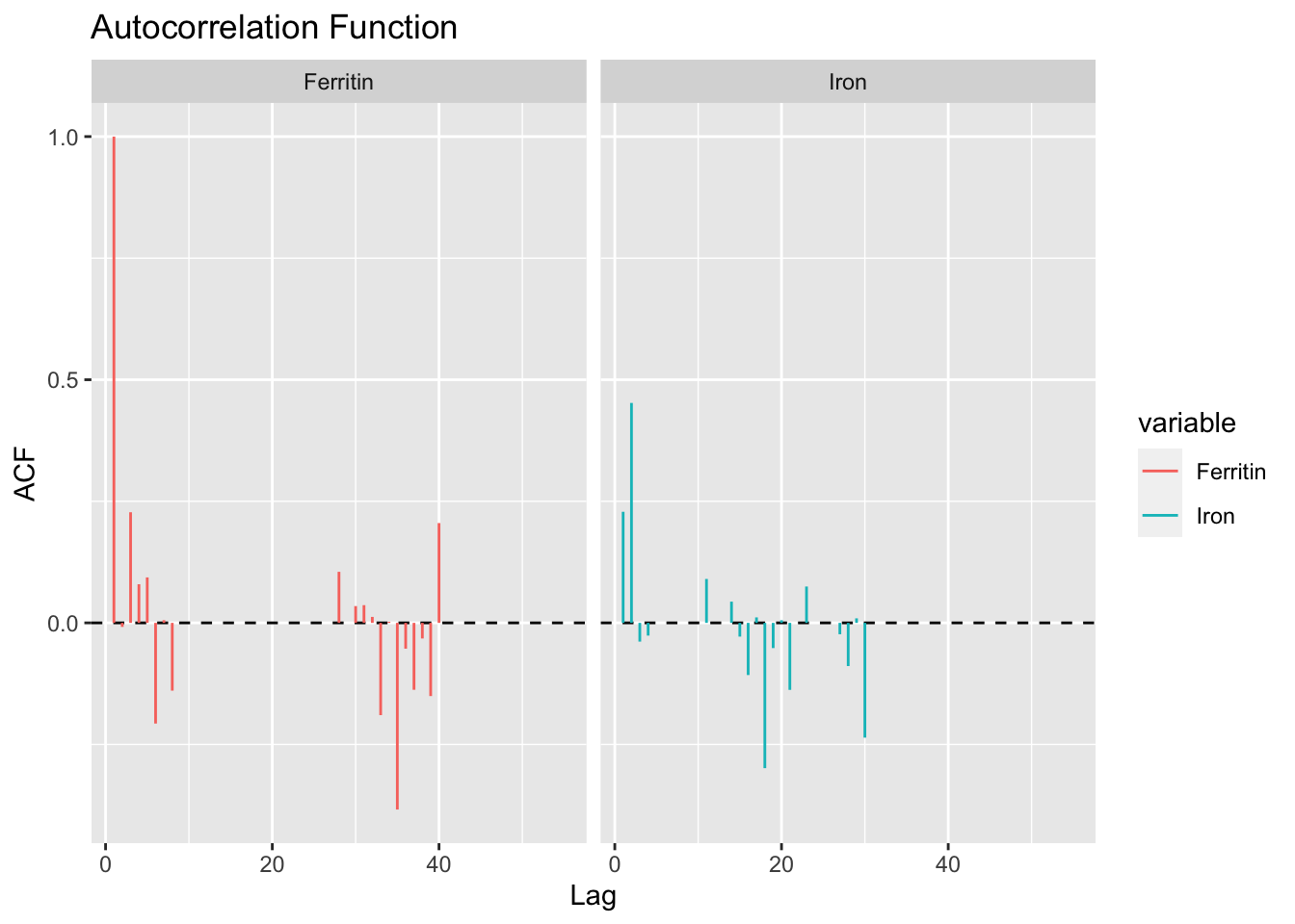
Autocorrelation for Ferritin and Iron. Longer bars indicate more correlation at the number of days (lag) since donation
While this is a difficult plot to understand, one interpretation is that some kind of effect is happening to the Ferritin levels about 20-30 days after a blood donation. But the effect is pretty small. I’m pretty sure this is due to my misunderstanding of how autocorrelation and correlation work.
Conclusion
Much as I hate to stop donating blood, which I think benefits health, beyond the obvious altruistic reasons, I think I’ll pause my donations until I can figure out what’s going on.
Update: After several useful comments on my Tweet about this, I also learned that Bloodworks Northwest offers free iron supplements to donors, especially those who donate more than three times a year (I’ve been doing more like 5x).
A friend also recommended I consider a full blood iron panel that includes total iron-binding capacity (TIBC), like the one available from Quest Labs ($60). Or I could break down and get the whole she-bang with the Ultimate test from InsideTracker that includes all those tests and many more for $650.
Next test in a month or two.
Footnotes
Turns out many other studies show the same low ferritin among frequent blood donors. Canada Blood Services changed their policies based on a large survey that showed many numbers (23% of females) of donors had low stores.↩︎