Code
library(tidyverse)
library(lubridate)
library(zoo)
library(gganimate)This is an exercise to show how a chart can be manipulated to show different conclusions. All of the plots below use the same accurate data pulled from a reliable source, and relate to an order announced on June 23 by Washington State Governor Inslee mandating mask-wearing statewide. The order took effect on June 29th.
By changing what I choose to emphasize – cases, deaths, hospitalization, ratios between them, per-day counts vs. rolling averages, etc. – I can tell different stories. I also make assumptions about the Governor’s order itself: does the date of the announcement matter, or is it when the order goes into effect? Maybe it’s something in between?
Note that these stories don’t require malevolent intent. A perfectly sincere analyst might choose one or the other of these pictures for entirely valid reasons. Often those reasons aren’t necessarily explicitly known, even to the analyst.
Here’s the code, in R. I start by loading a few common packages.
library(tidyverse)
library(lubridate)
library(zoo)
library(gganimate)Then read the raw data. You can get it live from https://covidtracking.com/data/download or save and read it locally.
As with most data science problems, the first step is “data wrangling” to put the raw numbers into a format that is consistent and relevant to the problem I’m trying to study. In this case I transform my data by inserting new variables that directly track the change for some of the parameters. The lag() function is super-handy for this. Note that I remove negative values when I do this, a seemingly innocuous decision that will have implications later.
daily_raw_wa <- read_csv("https://covidtracking.com/api/v1/states/wa/daily.csv")
# read_csv("~/Desktop/covid19-wa.csv")


mask_announce <- as_date("2020-06-23")
mask_effect <- as_date("2020-06-29")
healthcare_blm_protest <- as_date("2020-06-06")
chaz_end <- as_date("2020-07-01")
thanksgiving_day <- as_date("2020-11-26")
election_day <- as_date("2020-11-03")


daily_wa <- daily_raw_wa %>% transmute(date = ymd(as.character(date)),
                                       positive,
                                       negative,
                                       hospitalized,
                                       death,
                                       newdeath = if_else(dplyr::lag(death) - death > 0,
                                                          dplyr::lag(death) - death, 0),
                                       newpositive = positiveIncrease,  # if_else(dplyr::lag(positive)-positive>0,
                                                            # dplyr::lag(positive)-positive, 0),
                                       newnegative =  negativeIncrease,  #if_else(dplyr::lag(negative)-negative>0,
                                                             # dplyr::lag(negative)-negative,0),
                                       newhospitalized = hospitalizedIncrease,
                                       totalTestResultsIncrease) # dplyr::lag(hospitalized) - hospitalized)

daily_wa
Let’s start with the most basic chart, a look at positive cases over time, starting from near the beginning of the pandemic in early March.
daily_wa %>%
  mutate(var = positive, date) %>% dplyr::filter(date>"2020-03-01")  %>%
  ggplot(aes(x=date,y=var)) +
  geom_line() +
  geom_vline(xintercept = mask_announce, color = "red") +
  annotate("text",x=mask_announce-10, y = 15000, label = "Inslee's Mask Mandate\nannounced", color = "red") +
  labs(title = "Masks Don't Help", subtitle = "Cumulative Positive Cases",
       y = "Positive") +
  theme(axis.title.x = element_blank(),
        axis.text.x  = element_text(size = 18, angle = 90, hjust = 1),
        plot.title = element_text(size=18),
        plot.subtitle = element_text(size = 12))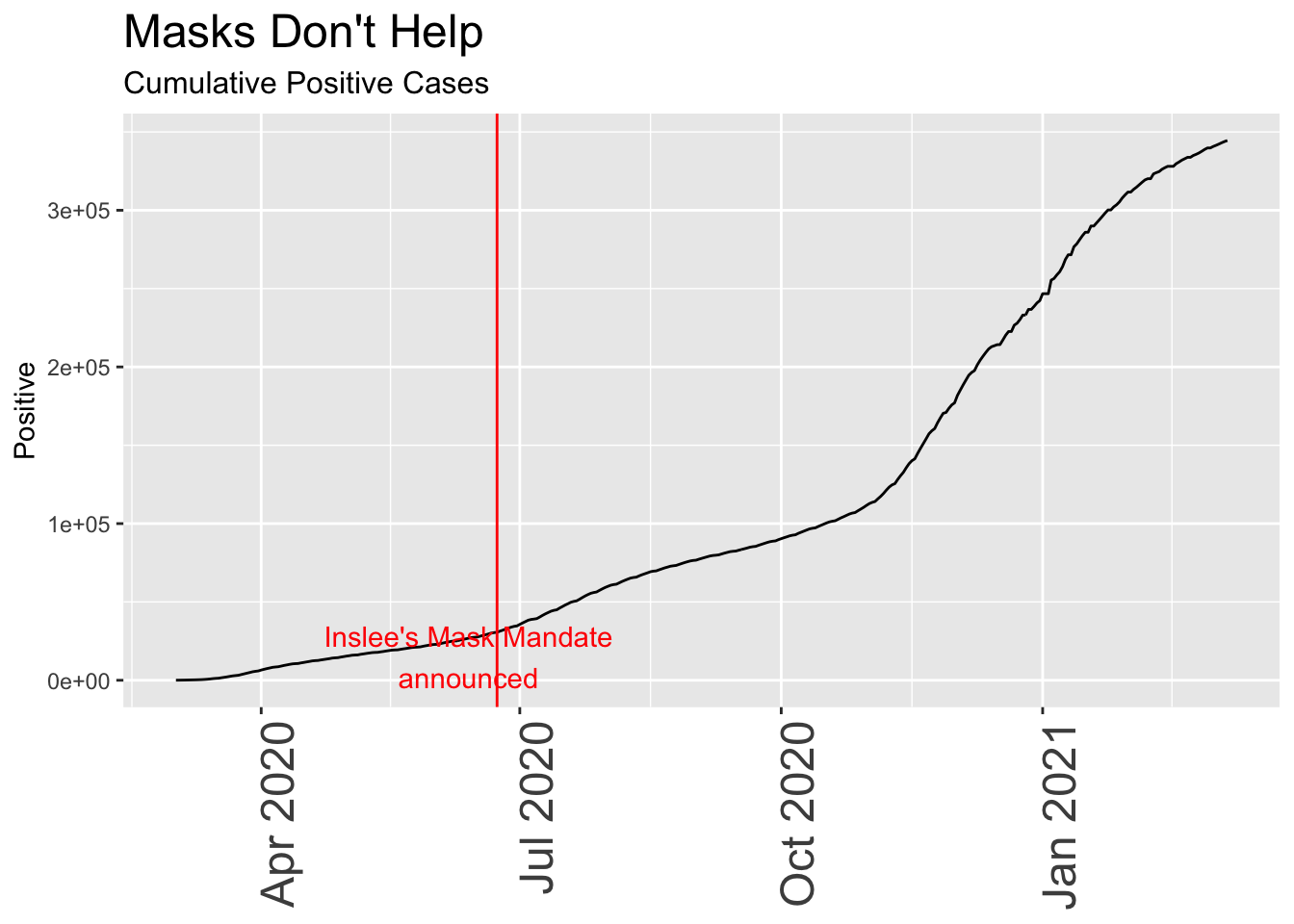
Although this seems scary at first – a relentless rise in cases that continues despite the mask mandate – looking simply at positive test results is misleading unless you know something about the total number of people tested, and the total of those who are hospitalized or die.
Remember that early in the pandemic, tests were limited to those who were very ill or otherwise had a good reason to be tested, a clearly biased sample that didn’t represent the population at large. Over time as testing capacity increased, the totals include many more people, including those who are asymptomatic or merely curious, some fraction of whom will turn out to be positive. For that reason, a fairer analysis often looks at the ratio of positive tests to total tests, i.e. the percentage of all tests that are positive. Because so many of those early tests were positive, the plot is more useful if we only look at the past month or so, when widespread testing of asymptomatic people became possible.
In this chart, I subtly switched the date for the mask mandate to when it actually went into effect, as opposed to the date it was announced. A seemingly innocent change, I may have done this without thinking of the consequences, but it happens to coincide to a period when cases have been sharply increasing, making it look more likely that the mask order itself caused the rise. The “break” in the line between Jun 15 and Jul 1 results from missing data; I deliberately threw out all negative values which sometimes arise when the reporting authorities revise previous data.
daily_wa %>%
  mutate(var = (newpositive / totalTestResultsIncrease) *100, date) %>%
  dplyr::filter(var < 100 ) %>%
  dplyr::filter(date>"2020-03-01" & date < "2020-12-31")  %>%
  ggplot(aes(x=date,y=var)) +
  geom_line() +
  geom_vline(xintercept = mask_effect, color = "red") +
  annotate("text",x=mask_announce+1, y = 12, label = "Inslee's Mask Mandate\ngoes into effect", color = "red") +
  labs(title = "Masks Don't Help", subtitle = "Daily Positive Cases as a Fraction of All Tests",
       y = "% Positive") +
  theme(axis.title.x = element_blank(),
        axis.text.x  = element_text(size = 18, angle = 90, hjust = 1),
        plot.title = element_text(size=18),
        plot.subtitle = element_text(size = 12)) +
  scale_x_date(limits = as_date(c("2020-06-01", "2020-07-25"))) # +
  #scale_y_continuous(limits = c(2,15))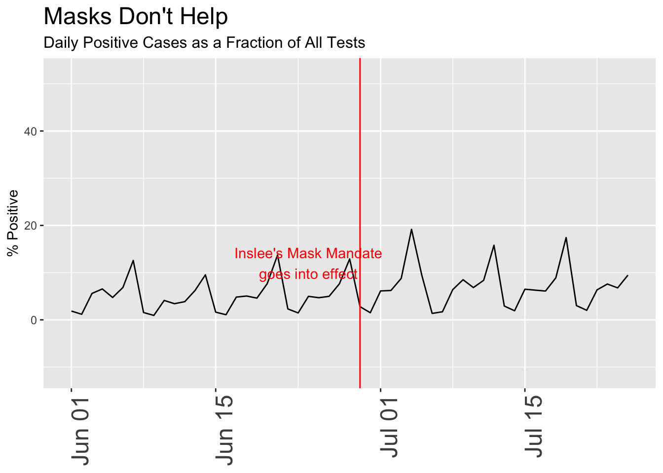
Now let’s really torture the data to “prove” what tragedy results from a Governor’s reckless decision to mandate mask-wearing for an entire state. As with all plots on this page, the underlying data is accurate, but I’m selectively showing only one view of it:
Now the case looks very serious. Masks are a terrible idea!
daily_wa %>% mutate(roll_ave = rollapply(newpositive,7, function(x) {x = mean(x,na.rm = TRUE)}, align = 'right', fill = NA)/72) %>% #View()
  select(var = roll_ave, date) %>% dplyr::filter(date>"2020-03-01")  %>%
  ggplot(aes(x=date,y=var)) +
  geom_line() +
      annotate("text",x=healthcare_blm_protest-days(5), y = 12, label = "Healthcare Workers\nBLM Protest", color = "blue") +
    geom_vline(xintercept = healthcare_blm_protest , color = "blue") +
  geom_vline(xintercept = mask_announce - days(7), color = "red") +
  annotate("text",x=mask_announce-25, y = 5, label = "Inslee's Mask Mandate", color = "red") +
  labs(title = "Masks Kill!", subtitle = "Daily Positive Cases / 100K population",
       y = "Positive Cases") +
  theme(axis.title.x = element_blank(),
        axis.text.x  = element_text(size = 18, angle = 90, hjust = 1),
        plot.title = element_text(size=18),
        plot.subtitle = element_text(size = 12))  #+
 # scale_y_continuous(limits = c(2,15))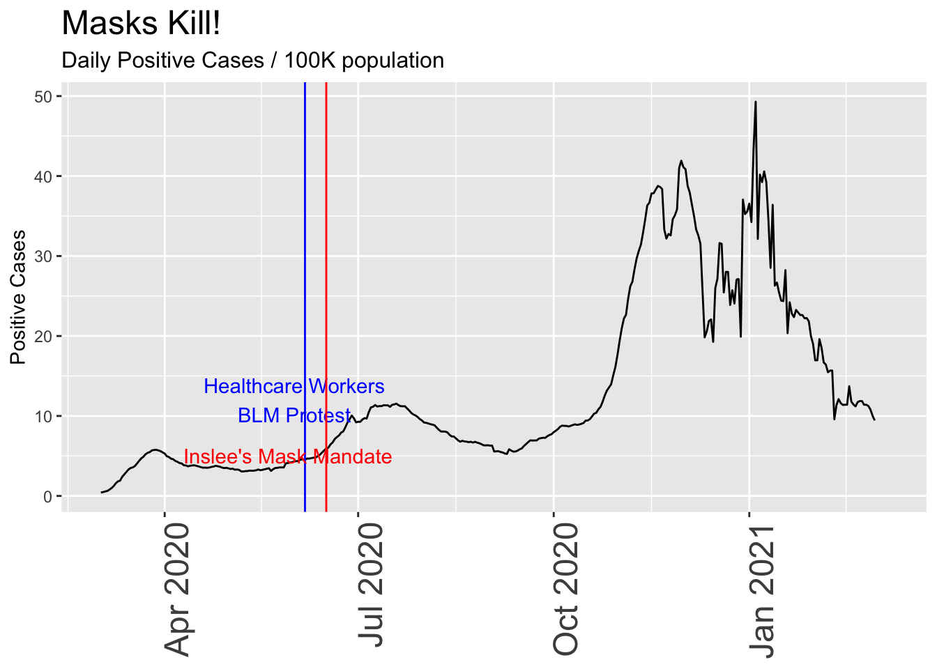
Now let’s make the data “prove” the opposite, that the mandatory mask order helps. I’ll switch to the following metrics:
p <- daily_wa %>%
  mutate(var = rollapply(newhospitalized,7, function(x) {x = mean(x,na.rm = TRUE)}, align = 'right', fill = NA)) %>%
 # mutate(var = newhospitalized, date) %>% filter(date>"2020-03-01")  %>%
  ggplot(aes(x=date,y=var)) +
  geom_line() +
      geom_vline(xintercept = healthcare_blm_protest , color = "blue") +
    annotate("text",x=healthcare_blm_protest-days(5), y = 50, label = "Healthcare Workers\nBLM Protest", color = "blue") +

      geom_vline(xintercept = chaz_end , color = "green") +
    annotate("text",x=chaz_end+days(5), y = 15, label = "CHAZ end", color = "green") +
  geom_vline(xintercept = mask_effect - days(3), color = "red") +
  annotate("text",x=mask_announce-5, y = 70, label = "Mask Mandate", color = "red") +
  geom_vline(xintercept = thanksgiving_day , color = "red") +
  annotate("text",x=thanksgiving_day-10, y = 70, label = "Thanksgiving Day", color = "red") +

  labs(title = "Masks Save Lives", subtitle = "Change in the Number of Patients Hospitalized Per Day",
       y = "Patients / Day ") +
  theme(axis.title.x = element_blank(),
        axis.text.x  = element_text(size = 18, angle = 90, hjust = 1),
        plot.title = element_text(size=18),
        plot.subtitle = element_text(size = 12)) +
  scale_x_date(limits = as_date(c("2020-05-18", today()))) +
  transition_reveal(date)

animate(p, renderer = gifski_renderer(loop = FALSE))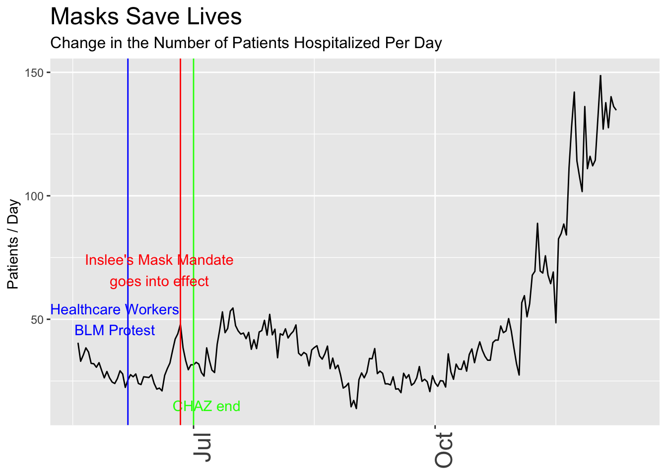
I could continue like this, tweaking the plots to emphasize or de-emphasize aspects of the data that I think are more or less important. It’s important to note that I wouldn’t necessarily need ill intent to come up with different conclusions. The assumptions I carry when I begin the analysis will influence the final result unless I’m extremely careful to consider many different ways to see the data.
Incidentally, the very act of focusing on this subject, mask-wearing and the dates behind a government order, is itself another bias because it ignores the many nuances involved, such as compliance rates, types of masks, other events happening at the same time and much more. It also implies that there might be a pattern in the first place, despite the very short time frame for the data.
My conclusion is that this is yet another argument for open data (show your calculations), free speech (so others can criticize and challenge me, even if they have ill intent), and the importance of humility and open-mindedness in any approach that involves data and statistics.