Using Autocorrelation (Tutorial)
Most personal science datasets come in a format known technicaly as a “stream”: rather than a single datapoint or two, the data is most interesting because it comes in a steady form over time. The timeframe might be days or weeks (say, if you measure your weight) or it might be minutes or seconds (heart rate), but these streams generally come as long sequences taken at roughly regular intervals.
Let’s start with a simple example using (average) resting heart rate and weight, both measured daily over a period of 100 days. I’ll generate a dataframe made of daily dates starting from the beginning of the year, with a resting heart rate (rhr) and weight both normally distributed around a mean of 70 and 160 respectively. I’ll also generate somedata that is just like rhr only with a hidden sine wave pattern embedded within. We’ll look at that in a bit.
my_data <- tibble(date = seq.Date(from = as_date("2020-01-01"), by = 1, length.out = 100),
       rhr = (rnorm(n=100, mean = 70)),
       weight = rnorm(n=100,mean=165),
       somedata = rhr +sin(seq(1,100))*100)

my_data <- tsibble(my_data) # %>%  pivot_longer(cols=rhr:somedata, names_to = "feature") %>% mutate(feature=factor(feature))
## Using `date` as index variable.my_data ## # A tsibble: 100 x 4 [1D]
## date rhr weight somedata
## <date> <dbl> <dbl> <dbl>
## 1 2020-01-01 69.7 166. 154.
## 2 2020-01-02 70.5 164. 161.
## 3 2020-01-03 67.1 165. 81.2
## 4 2020-01-04 71.9 164. -3.81
## 5 2020-01-05 72.3 165. -23.6
## 6 2020-01-06 68.7 164. 40.8
## 7 2020-01-07 70.5 165. 136.
## 8 2020-01-08 68.6 165. 168.
## 9 2020-01-09 69.6 164. 111.
## 10 2020-01-10 70.2 165. 15.8
## # … with 90 more rowsLet’s plot it to see how it looks
my_data %>% ggplot(aes(x=date, y = rhr)) + geom_line() +
  geom_line(aes(x=date,y=weight/2.3), color = "red") +
  scale_y_continuous("Percentage",sec.axis = sec_axis(~ . * 2.3, name = "Pounds"))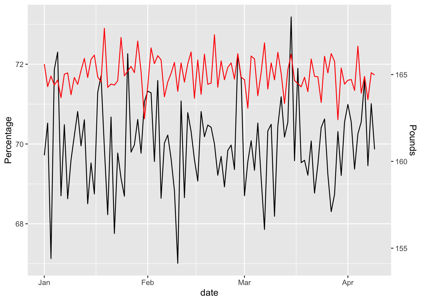
Looks pretty random, but is it really?
Let’s run a simple T-Test to see if the two streams are correlated.
with(my_data, t.test(rhr, weight))##
## Welch Two Sample t-test
##
## data: rhr and weight
## t = -632.66, df = 194.84, p-value < 2.2e-16
## alternative hypothesis: true difference in means is not equal to 0
## 95 percent confidence interval:
## -95.35085 -94.75821
## sample estimates:
## mean of x mean of y
## 69.97362 165.02815Wow, this is incredible! If a p-value less than 0.05 is considered the cut-off for statistical significance, our result is magnitudes better. Despite generating data from purely random numbers, what are the odds we’d get such an apparently perfect conclusion?
Unfortunately, the numbers only look correlated because of the way they were generated. This plot gives it away: the linear model shows an R^2 value close to zero and a near-horizontal line. Nope, these two are not correlated.
my_data %>% ggplot(aes(x=rhr,y=weight)) + geom_point() +
  geom_smooth(method = "lm", se=FALSE, color="black") +
            geom_point()
## `geom_smooth()` using formula 'y ~ x'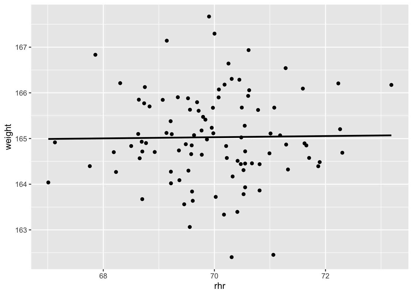
# R-Squared value
with(my_data, summary(lm(weight ~ rhr)))$r.squared
## [1] 0.0002095279So that’s it, right? Use R^2 instead of a T-test.
Not so fast…
In this dummy, made-up data, each point in the stream was generated completely at random. But real life data isn’t entirely random – in fact, the whole point of trying to track things is to find the non-random elements. If you have a resting heart rate of, say, 70 on a Monday, you might expect that the rate on Tuesday should also be pretty close to 70. I mean, it can go up and down a little, but you wouldn’t expect a major change unless something else was happening to cause it. If however, your rate goes up a little each day for a week, you might start to wonder if there’s a reason.
In other words, the expected rate of your variable (e.g. heart rate) on a given day is driven by two things: (1) external circumstances and (2) its previous value. Since the whole point of the experiment is to find the external circumstance that drives the change, we need to eliminate this second effect somehow.
When variables have some degree of correlation to one another (usually through time) we call this autocorrelation and here’s how you take it into account in your analysis.
Two built-in R functions make this easy: time series (ts()) converts my dataframe into a special data structure that understands data that occurs over time. Once I have a valid time series, then the handy R function acf() computes the autocorrelation and displays it as a series of charts like this:
acf(ts(my_data))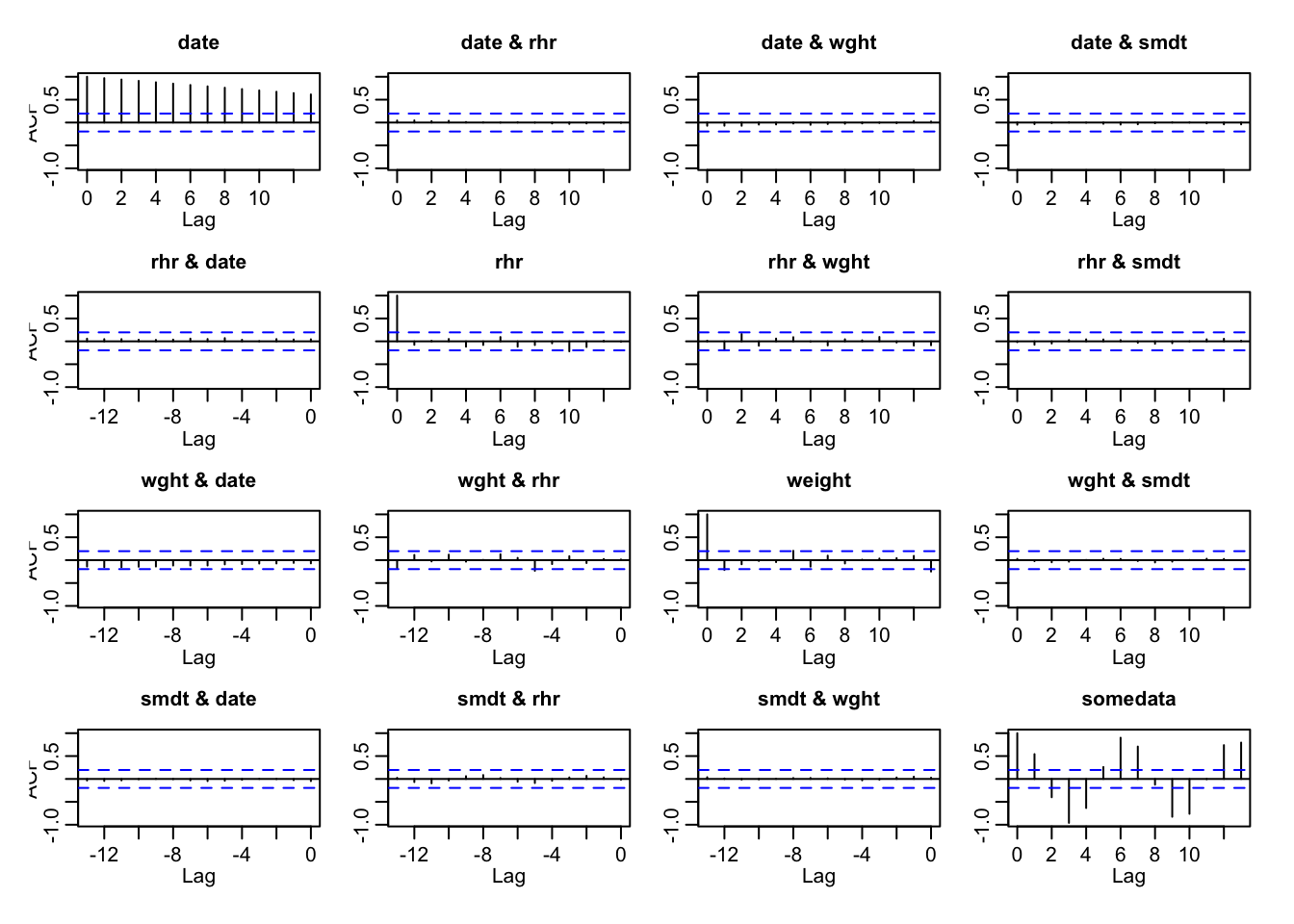
Those little vertical bars sticking out at each lag on the horizontal (x) axis indicate the amount of variance that is explained simply by the fact of two data points occuring chronologically near each other. Bars that go above the blue dotted line are lags that have meaningful significance.
The trivial case is with the date variable in the upper-left plot. All of the variance (1.0) can be explained when two dates are zero days apart from one another, with its intensity decreasing steadily over time. The other variables in this dataframe (weight and rhr) have very short vertical bars throughout that stay within the dotted blue lines, indicating that almost none of their variance is due to their chronological sequence. (Which is what we expect, considering the data was generated randomly).
The one exception is the made-up variable somedata, which we deliberately infected with a sine wave pattern that is clearly visible in the vertical bars in the lower-right plot.
Real World Data
Now let’s run the same analysis on some real data. We’ll pull the data about resting heart rate from OpenHumans and combine with my Apple Health data. We’ll also convert the data to a tsibble object, which is a tidyverse-compliant time series data frame.
library(httr)
library(tsibble)
# access_token <- "3p6KTiVy3pJH0UiP17Jt3Kt2uBA2Q1"  # UPDATE daily from Sys.getenv("OH_ACCESS_TOKEN")
# url <- paste("https://www.openhumans.org/api/direct-sharing/project/exchange-member/?access_token=",access_token,sep="")
# resp <- GET(url)
# user <- content(resp, "parsed")
# user_data <- user$data
# while (!is.null(user$`next`)) {
#   resp <- GET(user$`next`)
#   user <- content(resp, "parsed")
#   user_data <- append(user_data, user$data)
# }
# for (data_source in user_data){
#   if (data_source$source == 'direct-sharing-453'){
#     hr <- readr::read_csv(url(data_source$download_url),col_names=c("hr","date","type"))
#   }
# }
#
# my_weight <- read_csv("weight2020.csv") %>% mutate(date=as_date(Date), weight=value)
#
# hr_data <- hr %>% dplyr::filter(date>today()-months(15),type=="R") %>% mutate(date=as_date(date)) %>%
#   left_join(my_weight, by="date") %>% dplyr::filter(date>"2020-01-01" & date<"2020-03-30") %>% select(date,hr,weight) %>%
#   fill(weight, .direction = "up")  %>%  # replace NA weight values with whatever value precedes it.
#
#   distinct(date,hr,.keep_all = TRUE) %>% dplyr::filter(!(hr==64 & weight==164.5)) %>% tsibble()
hr_data <- read_csv("hr_data2020.csv") %>% as_tsibble()
## Parsed with column specification:
## cols(
## date = col_date(format = ""),
## hr = col_double(),
## weight = col_double()
## )## Using `date` as index variable. hr_data## # A tsibble: 85 x 3 [1D]
## date hr weight
## <date> <dbl> <dbl>
## 1 2020-01-02 55 165
## 2 2020-01-03 63 165
## 3 2020-01-04 55 165
## 4 2020-01-05 52 165
## 5 2020-01-06 54 163.
## 6 2020-01-07 55 162.
## 7 2020-01-08 54 163.
## 8 2020-01-09 57 162.
## 9 2020-01-10 60 162.
## 10 2020-01-11 59 161.
## # … with 75 more rowsand look at the correlations
hr_data %>% ggplot(aes(x=date, y = hr)) + geom_line() +
  geom_line(aes(x=date,y=weight/2.3), color = "red") +
  scale_y_continuous("Percentage",sec.axis = sec_axis(~ . * 2.3, name = "Pounds"))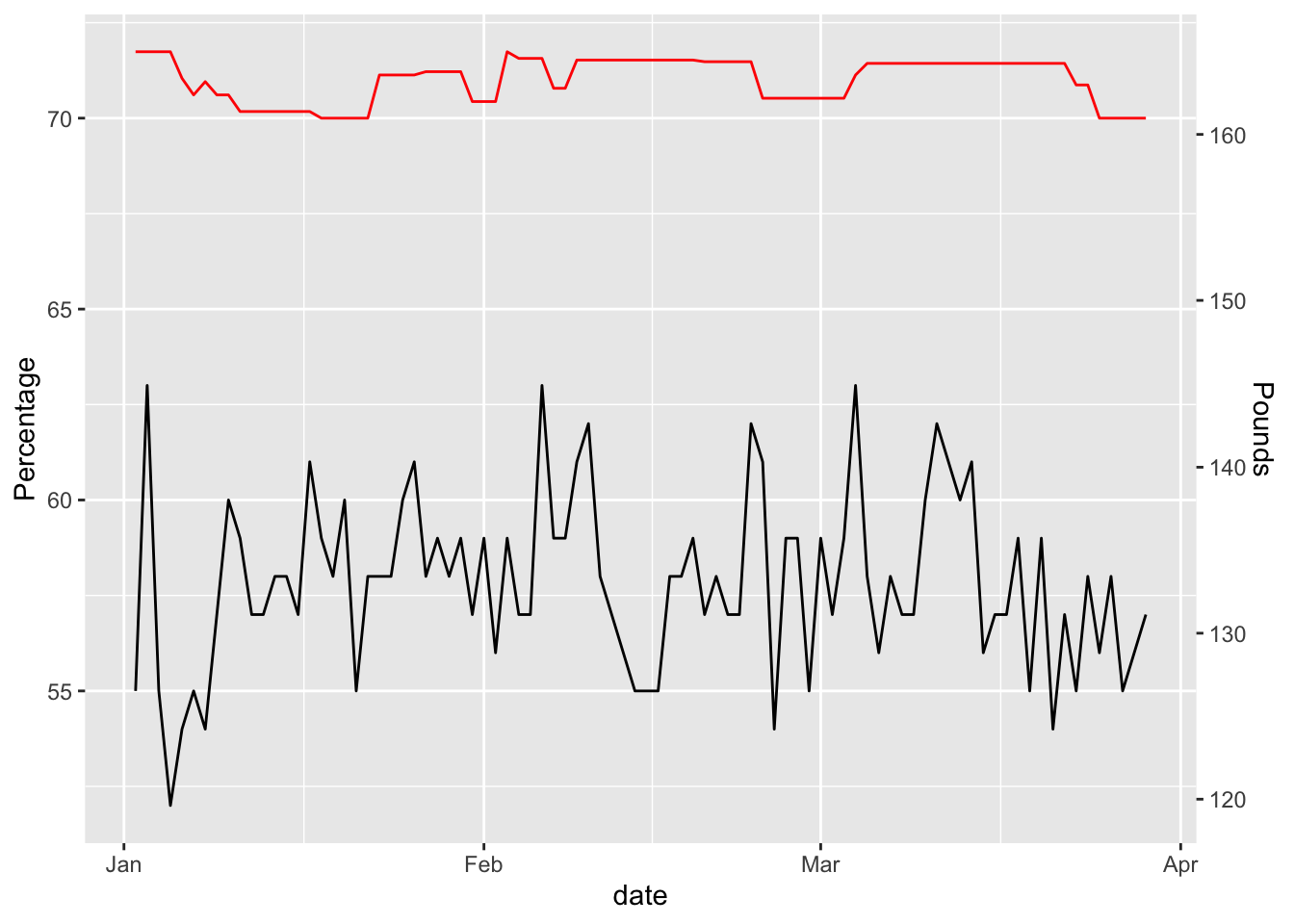
hr_data %>% ggplot(aes(x=hr,y=weight)) + geom_point() +
  geom_smooth(method = "lm", se=FALSE, color="black") +
            geom_point()
## `geom_smooth()` using formula 'y ~ x'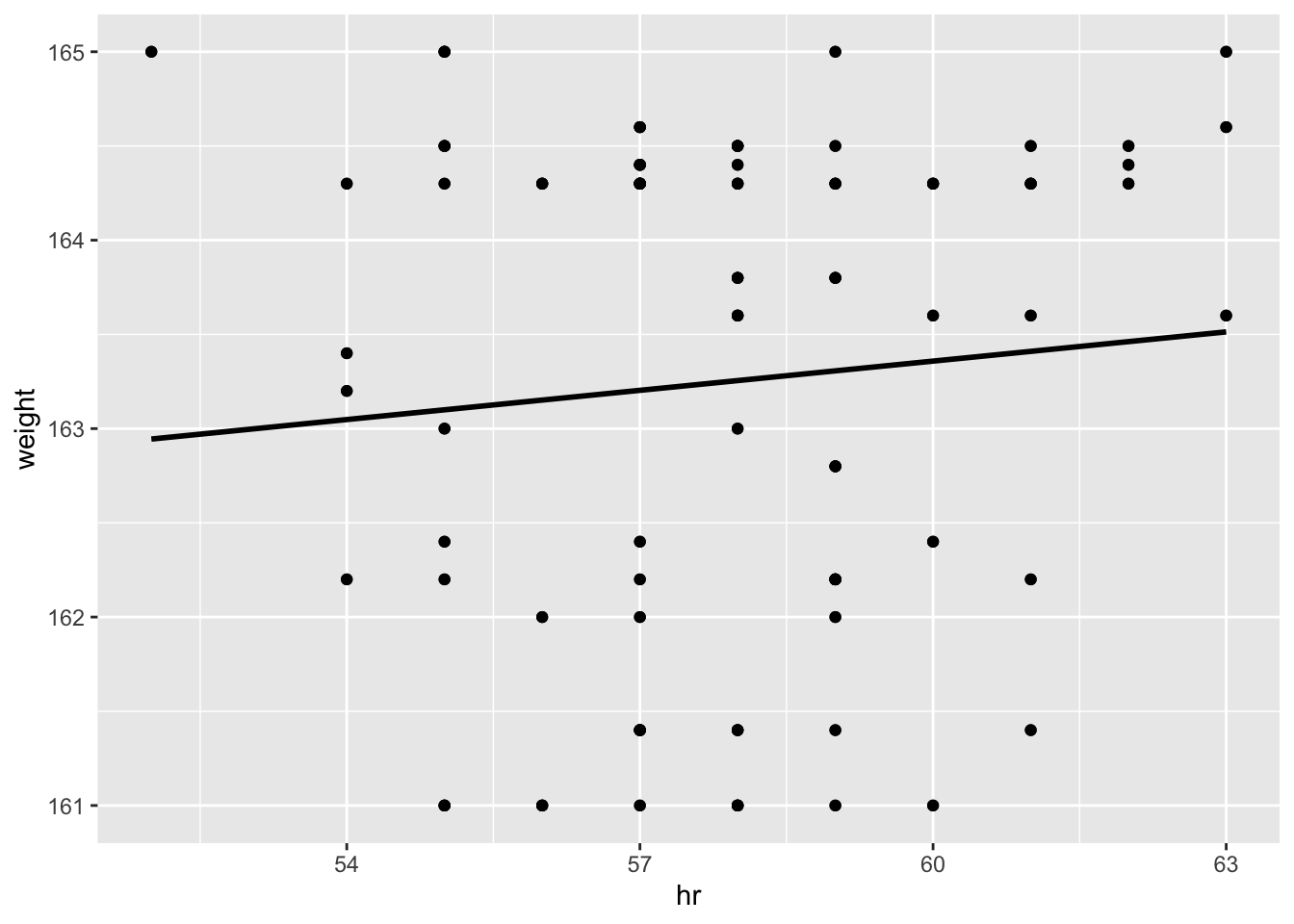
# R-Squared value
with(hr_data, summary(lm(weight ~ hr)))$r.squared
## [1] 0.007682562and now I’m getting a slight relationship between resting heart rate and weight, but at under 2% it’s hardly meaningful.
Let’s see if autocorrelation can tell us anything interesting
my_cors <- acf(ts(hr_data))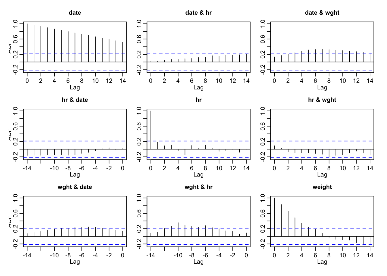
Indeed there is a substantial lag of about 10-12 days, when the actual heart rate and actual weight appear correlated.
Can we do anything with this information?
Let’s see if there’s more to this hr and weight situation
plot.new()
frame()
par(mfcol=c(2,2))
# the stationary signal and ACF
plot(1:85,hr_data$hr,
     type='l',col='red',
     xlab = "time (t)",
     ylab = "Y(t)",
     main = "Resting Heart Rate")
acf(hr_data$hr,lag.max = length(hr_data$hr),
         xlab = "lag #", ylab = 'ACF',main=' ')

plot(t,hr_data$weight,
     type='l',col='red',
     xlab = "time (t)",
     ylab = "Y(t)",
     main = "Weight")
acf(hr_data$weight,lag.max = length(hr_data$weight),
         xlab = "lag #", ylab = 'ACF', main=' ')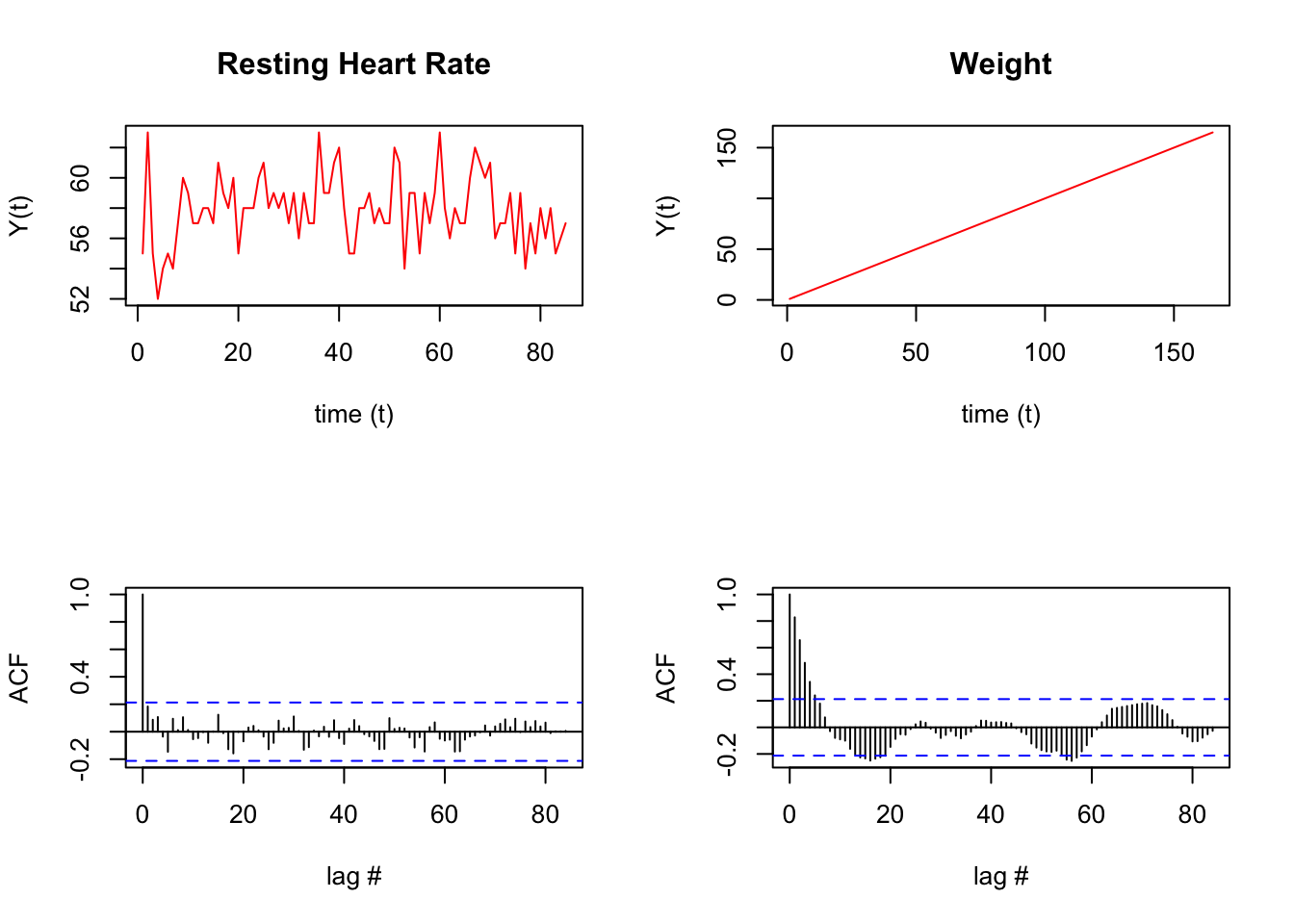
Run some statistical tests on the above data.
lag.length = 25
Box.test(hr_data$hr, lag=lag.length, type="Ljung-Box") # test stationary signal
##
## Box-Ljung test
##
## data: hr_data$hr
## X-squared = 19.061, df = 25, p-value = 0.7942Box.test(hr_data$weight, lag=lag.length, type="Ljung-Box") # test stationary signal##
## Box-Ljung test
##
## data: hr_data$weight
## X-squared = 187.47, df = 25, p-value < 2.2e-16There is something unusual about the hr data. See how at a lag of 6 and 11 days there’s a spike. Similarly, the weight data also has some odd periodicity
hr_data %>% tsibble::fill_gaps() %>% ACF(hr) %>% autoplot() + ggtitle("ACF: resting heart rate")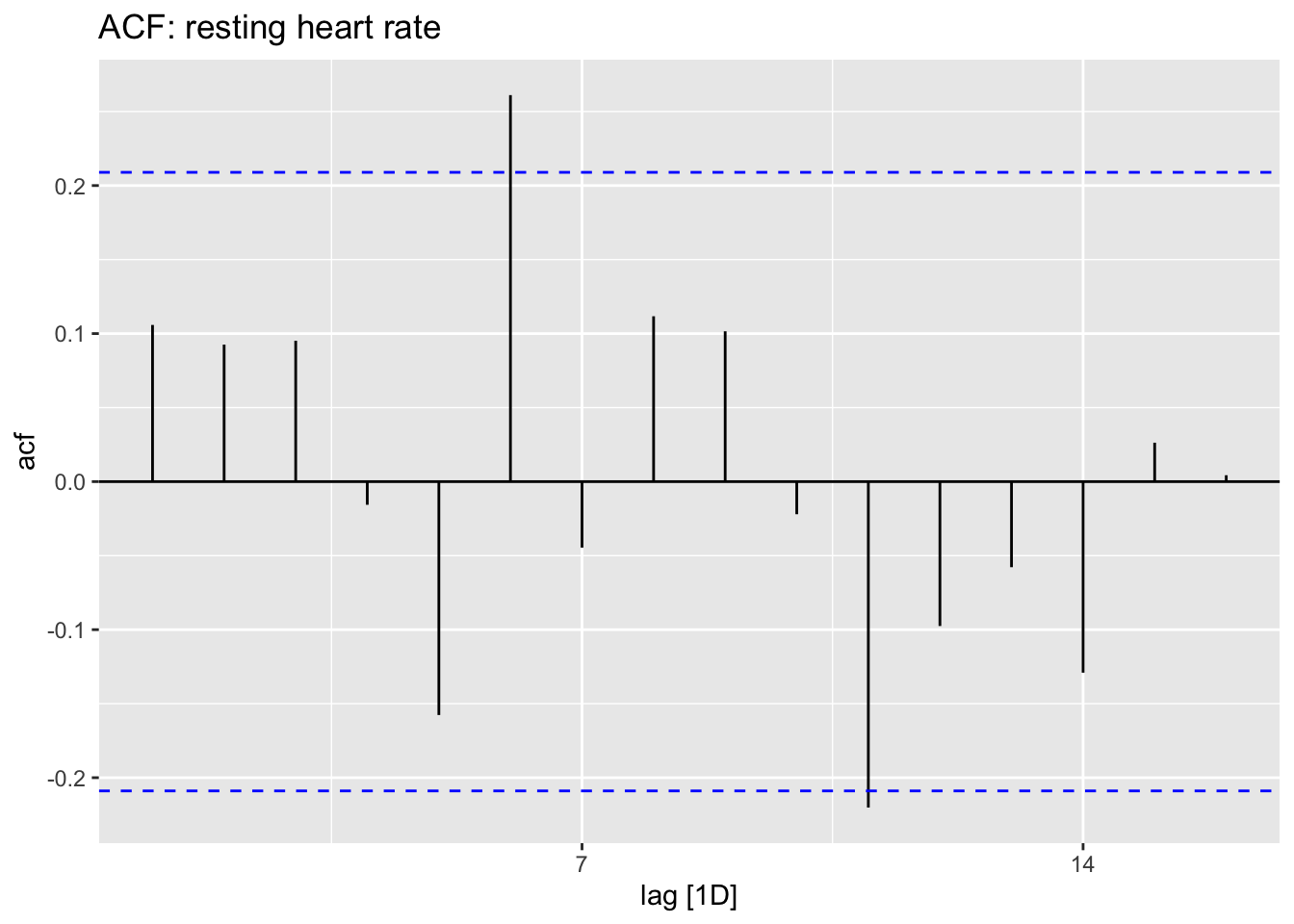
hr_data %>% tsibble::fill_gaps() %>% ACF(weight) %>% autoplot() + ggtitle("ACF: weight")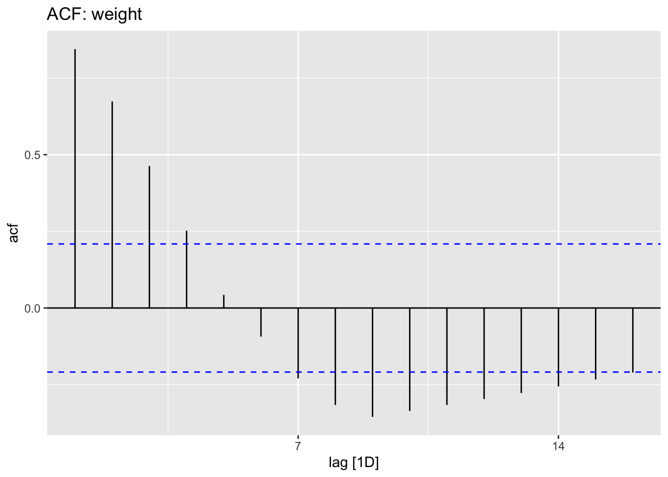
Let’s try to construct a model
# hr_data %>% tsibble::fill_gaps() %>% model(STL(hr))To be continued…