Best election map
Here's the best map I've seen yet, from Robert J. Vanderbei:
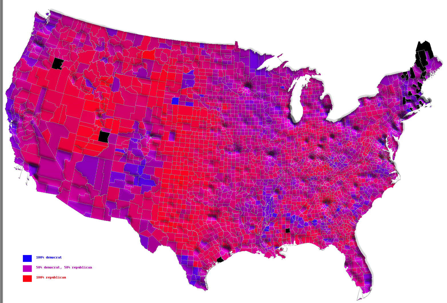
The shading represents the proportion of Bush vs Kerry voters, and the "mountains" indicate the population.
The shading represents the proportion of Bush vs Kerry voters, and the "mountains" indicate the population.