R-tude: Labels on a ggplot chart
Here’s a short example for how to print labels directly on a ggplot chart.
Using my new psmr package that contains all my microbiome data and some useful convenience functions, I generate a dataframe with all gut samples during the period of a colon cleanse experiment.
I begin with some setup work. This code chunk loads the colon cleanse experiment data into the Phyloseq object cleanse.phylum.norm and then generates the dataframe c_df whose columns contain phylum-level abundance data for each date within the experiment period.
library(psmr)
library(phyloseq)

cleansePeriod <- seq(from=as.Date("2015-10-01"),to = as.Date("2015-12-01"),by=1)

cleanse.phylum.norm <- phyloseq::subset_samples(sprague.phylum.norm,
                                                Site == "gut" & Date %in% cleansePeriod)
cleanse.phylum.norm <- phyloseq::prune_taxa(phyloseq::taxa_sums(cleanse.phylum.norm)>4000,
                                            cleanse.phylum.norm)

m <- psmr::mhg_abundance(cleanse.phylum.norm)
c_df <- data.frame(taxa = rownames(m), m)
colnames(c_df) <- c("taxa", colnames(m))
c_df <- c_df %>% gather(date, value,-taxa) %>%
  transmute(date = lubridate::as_date(date),
            taxa,
            abundance = value / 10000)
The chart itself is straightforward once the data is in the right format.
Notice the geom_text(): that’s where the labels themselves are generated. I arbitrarily chose a date "2015-10-01" to the left where the labels will fit.
ggplot(data = c_df, aes(x = date, y = abundance, fill = taxa)) +
  scale_y_log10() + #labels = function(x) log10(x) ) +
  geom_point(aes(x = date, y = abundance, color = taxa)) +
  geom_line(aes(x = date, y = abundance, color = taxa)) +
  geom_vline(xintercept = as.Date("2015-10-19"),
             color = "red", size = 2, alpha = .2) +
  geom_text(data = c_df %>% dplyr::filter(date == min(date)),
           aes(label = taxa,
               x = as.Date("2015-10-01"),
               colour = taxa,
               y = abundance)) +
  labs(title = "Phylum-level Changes Before/After a Colon Cleanse",
       y = "Abundance log10(%)") +
  xlim(as.Date("2015-09-28"),
       as.Date("2015-11-17")) +
  theme(legend.position = "none",
        axis.title.x = element_blank()) +
  annotate("text",
           x=as.Date("2015-10-19"),
           y=0.01,color = "red",
label = "Colon\nCleanse") 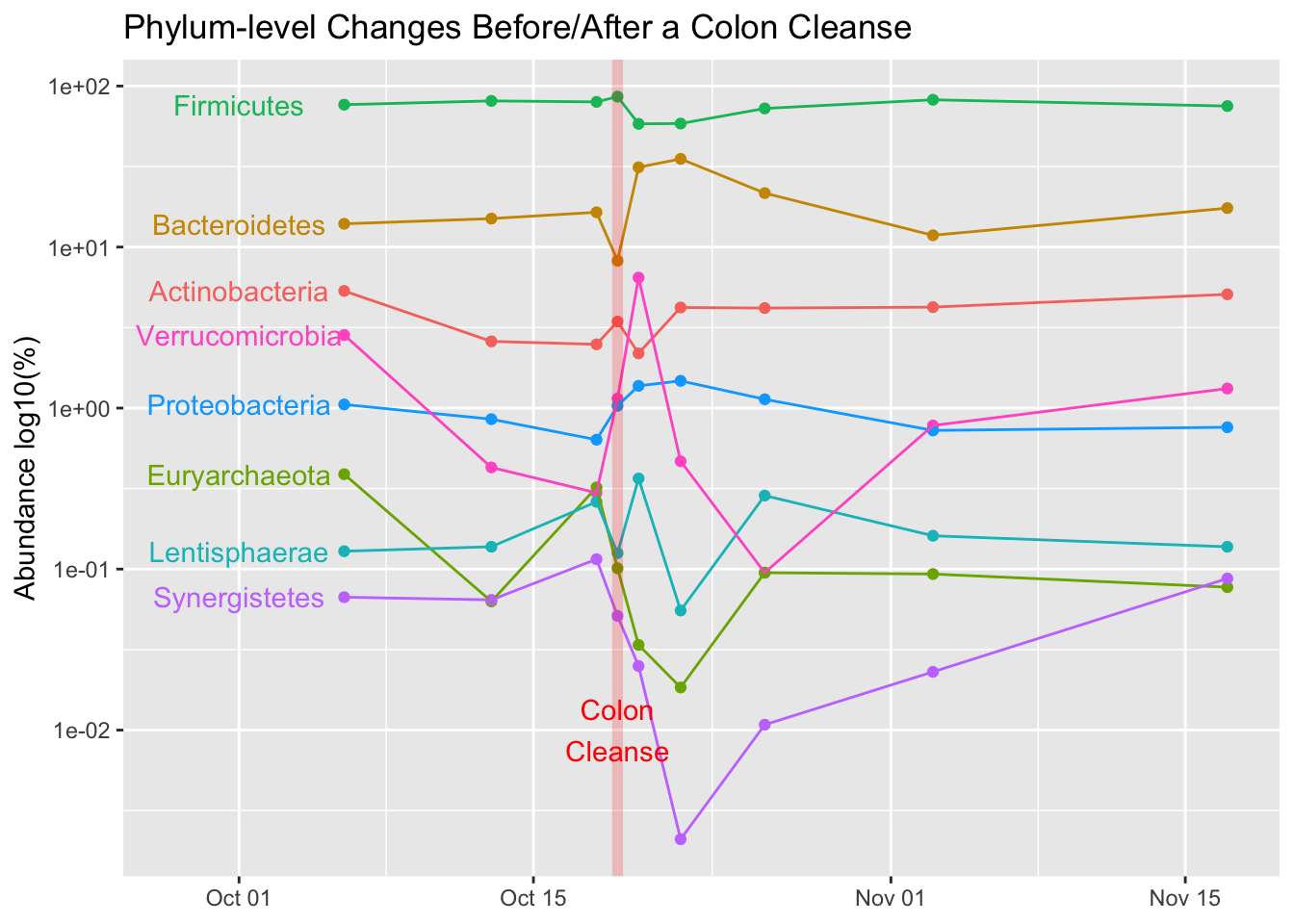
Yeah, I realize this isn’t a great general-purpose r-tude example, but I’ll look back on this post the next time I need similar styled labels.