Testing my blood glucose
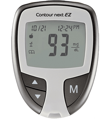
If you’re diabetic, blood glucose testing is something you live with daily, but it’s good for the rest of us to test from time to time as well. That’s what I did this morning using a Contour Next EZ blood glucose monitor, which at $10 (or free with a doctor’s prescription and a purchase of 100 strips) is the cheapest device I know.
Serious testers will want something that does continuous monitoring and connects to your computer for easy download, but I just wanted something simple and cheap. If you can get a doctor to prescribe it, I’ve heard the Dexcom CGM device is the way to go, but this is a simple and cheap way to get started and I just want to demonstrate briefly how easy it is to generate a glucose level graph in R.
To make it interesting, I tested myself immediately after waking up and then drank a glass of sugar water. After waiting another half hour, I tested again, then again at two more intervals after that. I tracked my blood glucose levels and then wrote the following R script.
First, load the prerequisite libraries. It’s super-easy if you use Tidyverse. In this simple example I won’t use any of the Tidyverse features other than graphics, so all of this extra loading is unnecessary, but I think it’s a good idea to get used to treating Tidyverse as an extension of your normal R environment. It doesn’t take much to load it, so why not? Just ignore all the “Loading” and “conflicts” messages.
library(tidyverse)Next I’ll set up my data. These are actual numbers taken from the glucose monitor. As you can see, I’m creating a simple data frame in R code. If this were a full example, I’d have the data in Excel or as a CSV file and then load it using read_excel(), but I don’t want to deal with that now, so I’ll construct the data frame by hand:
glucose <- c(85,141,75,74)
times <- c(0,30,30+45,30+45+20)
measures <- data.frame(glucose=glucose,time=times)
measures
## glucose time
## 1 85 0
## 2 141 30
## 3 75 75
## 4 74 95To plot it, I can simply run the ggplot function below, which will generate the default plot style or “theme”. But to make it look a little more cool, I can use the ggthemes library, which gives you a choice of themes, everything from “fivethirtyeight” to “tufte” and “wsj”. Here I’ll make my final result look like one of those charts you see in The Economist newsmagazine.
library(ggthemes)
theme_set(theme_economist())

ggplot(data=measures,aes(x=time,y=glucose)) + geom_line() +
  ggtitle("My Glucose Levels") +
  xlab("Time (min after waking)") +
  ylab("Glucose (mg/dL)") +
  annotate("text",x=10, y = 68,  label = "Drink Sugar Water", color = "red") +
  annotate("segment", x = 00, xend = 0, y = 70, yend = 80, colour = "red", size=1, arrow=arrow())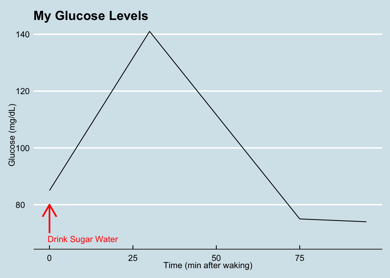
That’s it. Although this was a very simple – some would say trivial – example of graphing in R, I hope it’s helpful for absolute beginners who want to know how to get started.